
Since February, UF’s COVID-19 testing program has reported a campus positivity rate ranging between 2% and less and 1%. An analysis of state and university data shows trends that can’t be fully explained, partly because the dashboard doesn’t fully explain where its numbers come from — including the campus positivity rate.
UF’s COVID-19 dashboard has long been scrutinized, and its display has undergone numerous changes, often without warning or explanation. It’s a reflection of greater trends across the state, as reported numbers have been questioned and challenged since the start of the COVID-19 pandemic.
UF’s dashboard features two graphs that display data since the beginning of the pandemic, but doesn’t fully explain where the data comes from, who it excludes or who exactly constitutes a “UF affiliate.” When the totals are compared with state data, even more questions are raised about on-campus positivity rates and the way data is reported.
The Alligator spent two months analyzing and comparing state, county and university data. It found that the number of cases and tests reported by UF don’t match the cases in state reports. After talking to representatives and officials across the state, some pointed to different reporting methods and all directed to different agencies for explanations of how they report their numbers. Meanwhile, epidemiologists provided possible explanations for patterns and vagueness in university and state data.
UF has assured faculty, staff and students that its campus is safe and made reopening decisions based on the university's self-reported positivity rate. Despite constant pushback and criticism from faculty about their uncertainty and fears, UF pushed forward to reopen campus at a 2% positivity rate.
In a December announcement about UF’s reopening, Michael Lauzardo, director of UF Screen, Test & Protect, references a 2% positivity rate to justify reopening. But, neither the dashboard nor the announcement provides a comprehensive explanation of who is included in the positivity rate and where their tests come from.
“We feel that [the dashboard] is a good representation of what’s happening,” Roxane Wergin, director of external communications for UF Health, said.
But comparing the dashboard’s data with Florida Department of Health data raises even more questions, specifically because of a difference in positive and negative cases being reported.
How UF calculates its on-campus positivity rate
The dashboard’s first graph counts all daily tests performed by STP. Testing through STP, along with contact tracing, is used to calculate the university’s positivity rate, Ken Garcia, UF Health spokesperson said.
The graph only counts tests provided by STP, which are processed through UF Pathology Laboratories, or UF Path Labs, Garcia wrote. UF Path Labs is the main lab UF uses to process all STP tests.
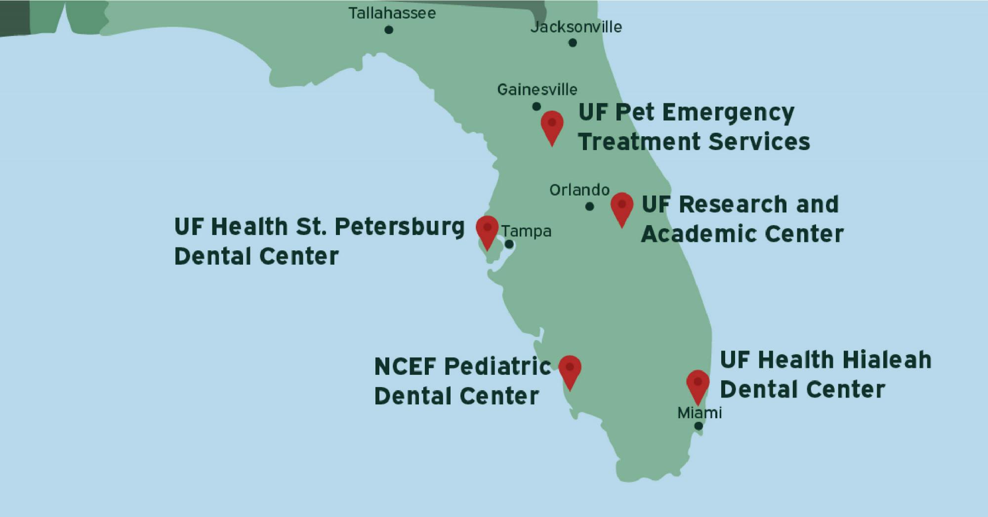
While STP records all testing done on UF’s main campus, some tests from UF Health Jacksonville can also roll into STP data, Garcia wrote. Other locations that could be counted in the data include UF Health Research and Academic Center in Lake Nona, UF Health Hialeah Dental Center, NCEF Pediatric Dental Center in Naples, UF Health St. Petersburg Dental Center and UF Pet Emergency Treatment Services in Ocala, Garcia wrote.
Garcia said the positivity rate UF uses to guide its reopening decisions primarily includes STP tests from the main campus, but UF’s dashboard does not indicate how many of STP’s tests come from these alternative locations. Garcia said this data was “not readily available,” meaning it’s unclear how many people from these locations are included in UF’s on-campus positivity rate and how many of these tests are coming from outside Alachua County.
UF does not provide a list of its tests based on the labs where they are processed. However, the Florida Department of Health does.
UF Path Labs' data is accessible in a dataset provided by FDOH. In this dataset, the department lists each lab that processes COVID-19 tests in Florida, indicating how many positive and negative cases each lab has processed since the onset of the pandemic last March.
When comparing the UF Path Labs’ data and UF’s dashboard, the counts of negative and positive tests don’t match, because the state’s lab data does not account for every negative and positive test. Instead, the state reports cases based on individuals tested, an FDOH spokesperson wrote in an email.
“For example, if an individual has been tested five times at UF [Path] Lab, they will only show one time in the table,” the email read.
The state has strayed away from this classification method since last October, and the state’s main COVID-19 dashboard changed from counting one test per person to all test encounters people have, according to the Miami Herald.
The FDOH would not explain why the lab data still counts tests this way. The office of communications has not responded to two emails and two calls inquiring about the lab data’s distinct classification method.
Despite this different classification method, the FDOH data for UF Path Labs still displays more positive test results than UF’s number of daily UF COVID-19 tests performed chart.
Similarities, discrepancies and unanswered questions
Based on state lab data from September to March 1, UF Path Lab has reported about 6,900 positive COVID-19 cases; however, UF’s dashboard of daily tests performed shows about 2,300 fewer positive cases.
Garcia’s explanation for the discrepancy is that UF Path Labs also tests some non-UF community members in Gainesville — another detail that’s not explained on UF’s dashboard or in the state’s data.
“The Path Lab processes tests from STP and the community which is what is sent to the state,” Garcia wrote.
However, this doesn’t explain the differences between the data’s moving averages.
Around November, the UF’s seven-day average of daily tests performed through STP, which is used to calculate its on-campus positivity rate, diverges from the seven-day average reported by FDOH, showing a significantly lower number of positive cases.
After November, both seven-day averages begin to follow similar trends. The total UF Path Labs data reports higher seven-day averages than the UF dashboard’s data — this is to be expected because the total UF Path Labs data also includes non-UF people tested in the community.
But for several months, the lines mirror each other’s shapes closely. Throughout January and February, the two lines have near-identical peaks and valleys during the exact same times.
Based on UF Health’s explanations, in order for the state’s UF Path Labs data and UF’s dashboard data to mirror each other, the difference between the two seven-day averages has to be made up of non-UF community positives processed by the Path Lab.
So, for several months, the number of positive tests that aren’t from UF-affiliates that were processed by UF Path Labs would have to remain consistent with the positives among UF-affiliates through STP— with little to no unique variation — for the lines to mirror each other.
Dr. Jason Salemi, a professor of epidemiology at the University of South Florida, speculated the ages of the community members that are being tested through UF Path Labs might resemble the ages of UF’s population, which could be why the lines are so similar.
“They’re all part of the larger community, and when we have increased viral transmission it affects all members of the same community,” Salemi said.
He said if UF is testing students, faculty and other affiliates, it’s going to see an array of ages that are probably similar to the community.
STP tested few community members in the Fall, Garcia wrote. This could explain why the lines were so close to each other until about November when UF began increasing its community testing.
Garcia said UF Path Labs processed more tests from the community and UF-affiliates as the holidays approached. This was his explanation for the lines diverging around November. He did not explain why the lines’ shapes appeared nearly identical between January and February.
Alachua County’s seven-day averages also follow the same trends as those of UF and FDOH.
“They’re just a microcosm of the broader community at large, and that’s why you tend to see the shape of these curves marry each other,” Salemi said.
The relationship between the lines shows there is no difference in the transmission patterns between the university and Gainesville, meaning you’re exposed equally in both settings, Dr. Edwin Michael, a professor of epidemiology at the University of South Florida said.
“So, you’ve not made campus safe, in other words,” Michael said.
Shrouded in uncertainty
Following backlash from faculty members who felt reopening the university wasn’t safe, UF spokesperson Steve Orlando told the Gainesville Sun that a study published Jan. 13 showed COVID-19 outbreaks at UF do not translate to outbreaks in the surrounding community.
Alachua County has a population of 269,043, according to the latest census data. There are roughly 25,000 students enrolled in at least one in-person class for the Spring semester, but it’s reasonable to assume there are more UF students living in Gainesville, Orlando wrote in a text.
This doesn’t mean the Gainesville community is affecting UF’s COVID-19 rates, Salemi said.
“It’s not that the community affects UF, UF is just a part of the community,” Salemi said. “In COVID-19 times, [UF affiliates] are more in the community than they are on campus.”
The seven-day average similarities between UF’s dashboard, the state’s UF Path Labs data, and the county show the importance of coordinated efforts at reducing or curbing community transmission of the virus, Salemi said.
University’s faculty have been searching for accountability and responsibility from UF administration as more face-to-face classes have been added, Dr. Steven Kirn, a retired UF faculty member now serving as Co-Chair of the United Faculty of Florida-UF’s COVID-19 task force said.
“There has been a disruption of trust in UF’s decision-making processes and their attitudes towards the faculty,” Kirn said.
Jacob Fiala, a graduate student at the UF, has been keeping track of UF’s dashboard since it started tracking data. He’s skeptical about whether the community similarities explain why UF’s dashboard and the data from UF Path Labs match so well.
Because UF accounts for a significant amount of testing in Alachua County, it isn’t surprising that the county’s line matches so well with UF Path Labs, Fiala wrote in a text. But Fiala compared state lab data from UF Health Shands Hospital with the UF Path Labs and dashboard data, and the lines weren’t as similar.
If UF and the community’s tests are so similar, then using a testing site that tests more community members than UF affiliates should mirror the trends as well. UF Health Shands Hospital doesn’t.
The seven-day average of UF Health Shands Hospital’s daily tests does not correspond with the seven-day averages shown by the UF dashboard and UF Path Labs data.
Salemi said this is odd, but he does not find the non-correspondence surprising.
“There’s a lot of variability in the patterns of positivity across labs for a number of different reasons, including who they're testing, when they're testing people and the volume of testing that they're doing at those sites,” Salemi said.
“We wouldn’t expect the patterns to be right on top of each other for all labs,” he said.
If healthcare professionals make up the bulk of testing done at Shands, it makes the graph make more sense, as they’re at a lower risk to test positive for COVID-19, Salemi said.
“Even though they're putting themselves in high-risk positions, they're taking all of the precautions,” Salemi said.
Garcia said the UF Health Shands Lab processes tests for people going to the hospitals. Its patient demographic can be made up of locals in Gainesville as well as people from around and out of the state.
Salemi said it has been difficult for the public to receive specific information about COVID-19 numbers.
“Often we are only working with partial information and there's not much benefit from being specific in the absence of concrete information,” Salemi wrote in a text. “One can only get themselves in trouble trying to be specific, especially if they are wrong.”
Roxane Wergin, director of external communications for UF Health, said it would be too complicated to have a dashboard that includes the “asterisk-type of information” — details such as who exactly constitutes a UF-related individual and where STP’s positive tests come from.
“We wouldn’t explain that on this [dashboard] — this is meant for public consumption,” Wergin said.
Although Salemi said institutions such as universities and the FDOH are doing a great job in accurately compiling and reporting COVID-19 data, he said a certain level of transparency is key.
“I do think that it's important that people who are trying to access information from reliable resources get as much information as possible to help them to understand that data,” Salemi said.
Contact Kevin Maher at kmaher@alligator.org. Follow him on Twitter @KevinMaher_.

Kevin Maher is a senior at the University of Florida and an investigative news assistant at The Alligator. He's also an impartial fan of "the greatest basketball team on the planet," the Los Angeles Lakers.